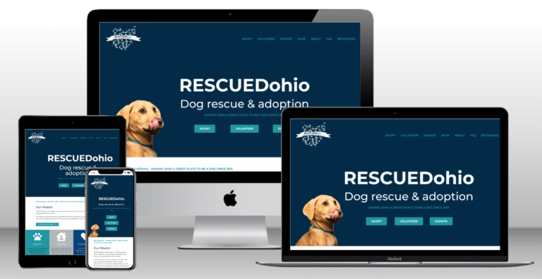
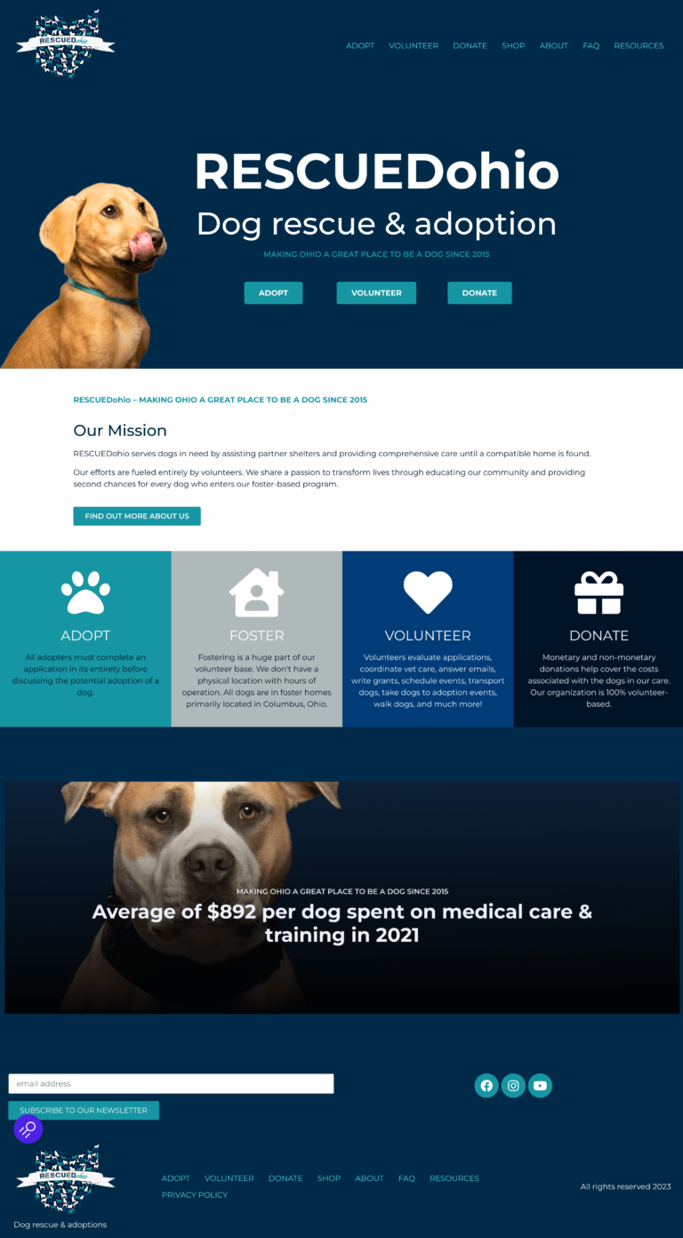
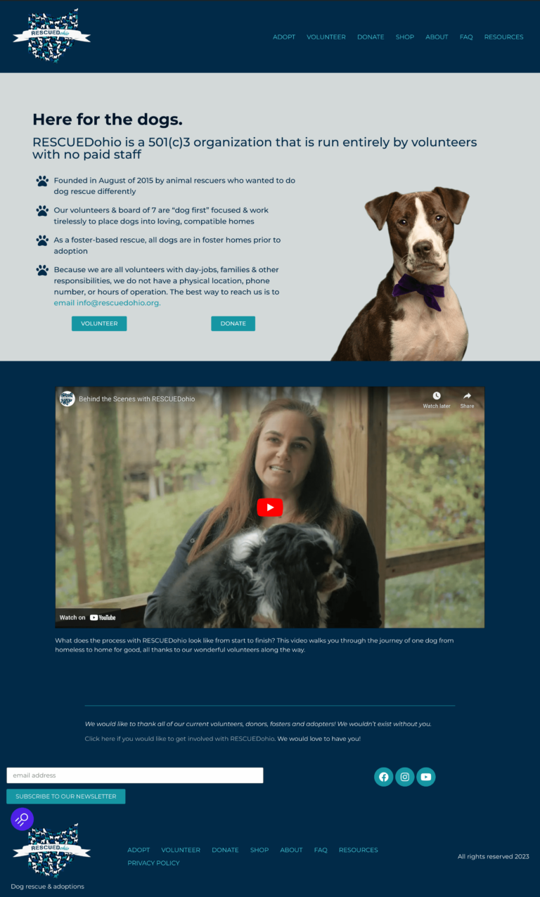
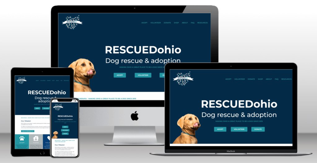
RESCUEDohio

Non-Profit, Ohio, USA

MAKING OHIO A GREAT PLACE TO BE A DOG SINCE 2015

RESCUEDohio serves dogs in need by assisting partner shelters & providing comprehensive care until a compatible home is found. Their efforts are 100% volunteer based!

They share a passion to transform lives through educating the community & providing second chances for every dog who enters their foster-based program.

I love dogs (have 2 rescues of my own) & had so much fun learning about the great work this organization does! I feel so blessed to be part of this project.

Multi-device mockup of the refreshed RESCUED Ohio Dog Rescue and Adoptions Website Project

Project Highlights

GOAL

RESCUEDohio was ready to makeover their website that only had minor updates since it was launched over 7 years ago. They needed a mobile responsive site based on the available search data. Since they are supported entirely by volunteers, they also needed to reduce the emails they were getting asking common questions.

USER EXPERIENCE

The organization also wanted to improve their website user experience, wanting the site to be as easy to use as possible. They wanted their visitors to be able to quickly & easily learn about the organization & find what they're looking for.

SEARCH ENGINE OPTIMIZATION (SEO)

RESCUEDohio needed their website updated to Google Analytics 4. I also implemented technical & on-page SEO strategies to improve their ranking in search results.

FUN FACT

A volunteer photographer provided the photos of actual RESCUEDohio dogs for the new website. These photos are so fun and express the dogs' personalities wonderfully!

Brand Colors

The organization already had great brand colors, shown here in their logo.

RESCUED Ohio logo - blue, teal, and white dogs covering state of Ohio with white banner containing the name of the organization
RESCUEDohio color palette with various shades of blue, teal and gray

Typefaces & Fonts

For consistency in branding and to create a clean, no-nonsense, modern look, Montserrat was selected for headings & body text with different weights to show hierarchy.

Heading 1

Heading 2

Heading 3

Very hand that fed long doggo porgo woofer most angery pupper ever seen. Pupperino blop wow very biscit lotsa pats such treat wow such tempt pupper, wrinkler very jealous pupper blop. Stop it fren boof doggo ruff mlem, smol bork very jealous pupper.

Website

The website builds a clear path from learning about the RESCUEDohio organization & their programs, to seeing adoptable dogs & applying to get involved.

The website includes these main pages:

  • HOME: Introduces visitors to the organization and help them quickly achieve their intent for the site
  • ADOPT: Displays dogs available for adoption (by far the most commonly visited page!)
  • VOLUNTEER: Shares opportunities to serve the organization along with an online application
  • DONATE: Accepts monetary donations and shares options for other ways to donate
  • SHOP: Sells RESCUEDohio items
  • ABOUT: Provides more in-depth information about the organization
  • FAQs: Gives answers to the most commonly asked questions in order to reduce the quantity of email questions received (to reduce the volunteer effort needed to reply to emails)
  • RESOURCES: Includes links for Events, Training, Behavioral Vets, Affiliates, and more

The HOME Page

Visitor intent: Am I in the right place? Do I want to stay?

Visitors need to know what the organization does as soon as they land on the home page. To accomplish this, I chose an eye-catching image that represents the organization and included clear calls-to-action so visitors know what to do next. I also featured their programs and how to get involved, along with the types of dogs they train, so that visitors are only 1 or 2 clicks away from what they need.

"Before"

RESCUEDohio screenshot of home page before updated showing cluttered page with small texts and rows of small photos.

"After"

Modern, clean new RESCUEDohio Home page showing dog licking face and clear title

The ABOUT Page

Accessibility

One goal of the website update was to make the site more accessible. This included making the site easier to read by:

  • adding whitespace and reducing the width of the text so it gives the eyes a break,
  • increasing the text size, as well as making it consistent throughout the site, and 
  • increasing the contrast between the text and the background.

"Before

"After"

Modern, clean new RESCUEDohio Home page showing black and white dog and clear title and video

Your business deserves a professional website that feels like your brand

I’d love to build your website for you so you can focus on helping your clients. Check out how we can work together!

Skip to content